Product page conversion rate optimisation is often the difference between browsers and buyers.
In this case study, we redesigned a mobile product page to reduce friction, improve clarity, and surface key trust signals earlier in the decision-making process. Rather than adding more content, the focus was on restructuring what already mattered — visuals, benefits, and reassurance.
Below is a breakdown of the exact product page UX changes made.
Reduced exits on product pages by improving clarity before users reached checkout.
More users added products to cart after improving visual hierarchy, benefit messaging, and page structure.
Higher percentage of product page visitors progressed into the checkout flow after UX optimisation.
All improvements delivered through small, strategic updates and monitoring.
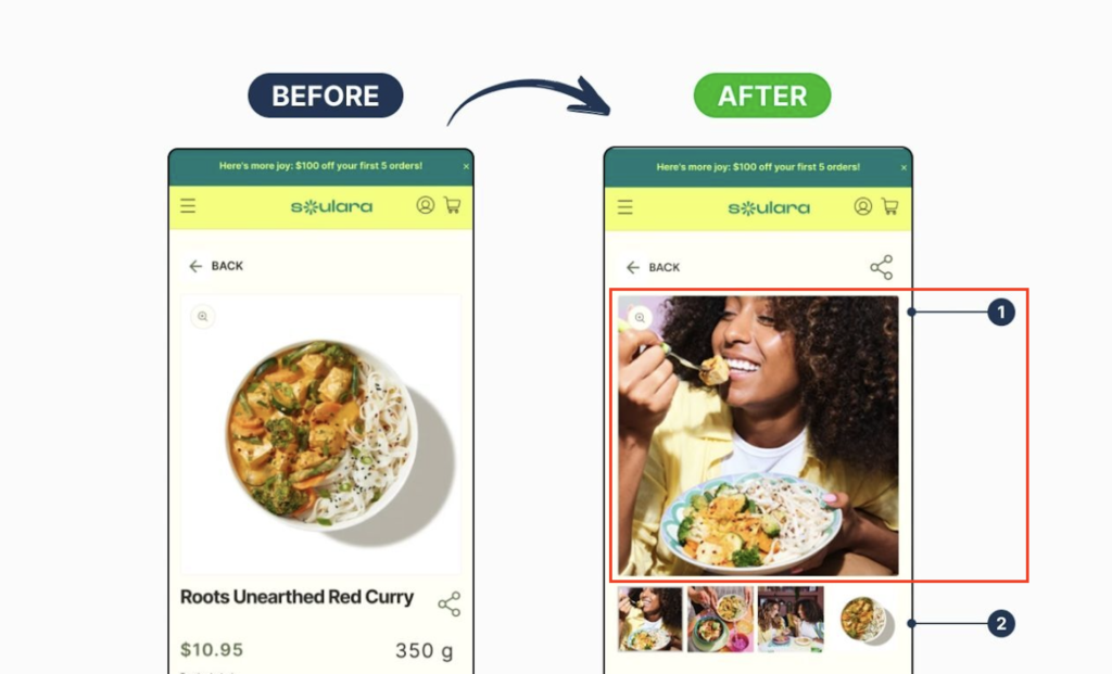
We replaced static product imagery with a lifestyle-focused hero image that shows the product being used in context.
This immediately communicates quality, relevance, and emotional appeal helping users visualise the product in real life rather than evaluating it as a standalone item.
Why it matters:
Stronger emotional connection increases engagement and purchase intent early on the product page.

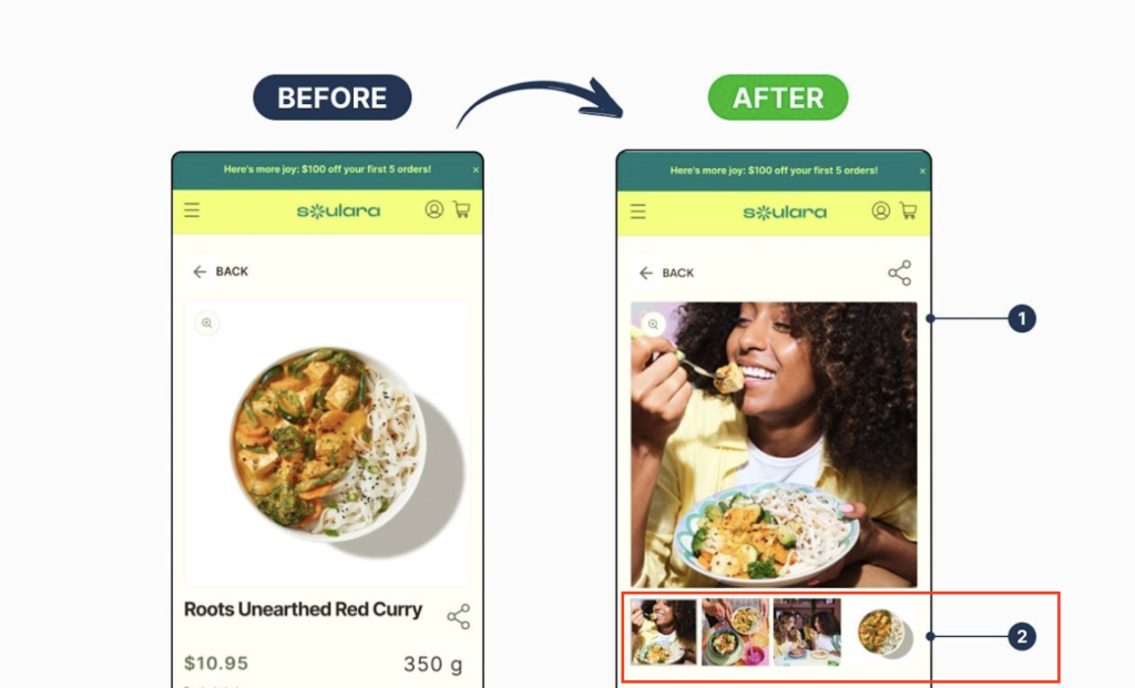
Additional thumbnail images were added beneath the main image to showcase variations, close-ups, and alternative angles.
This mimics an in-store experience and removes common visual objections that can delay or prevent purchase.
Why it matters:
More visual certainty leads to fewer unanswered questions and higher product page conversion rates.

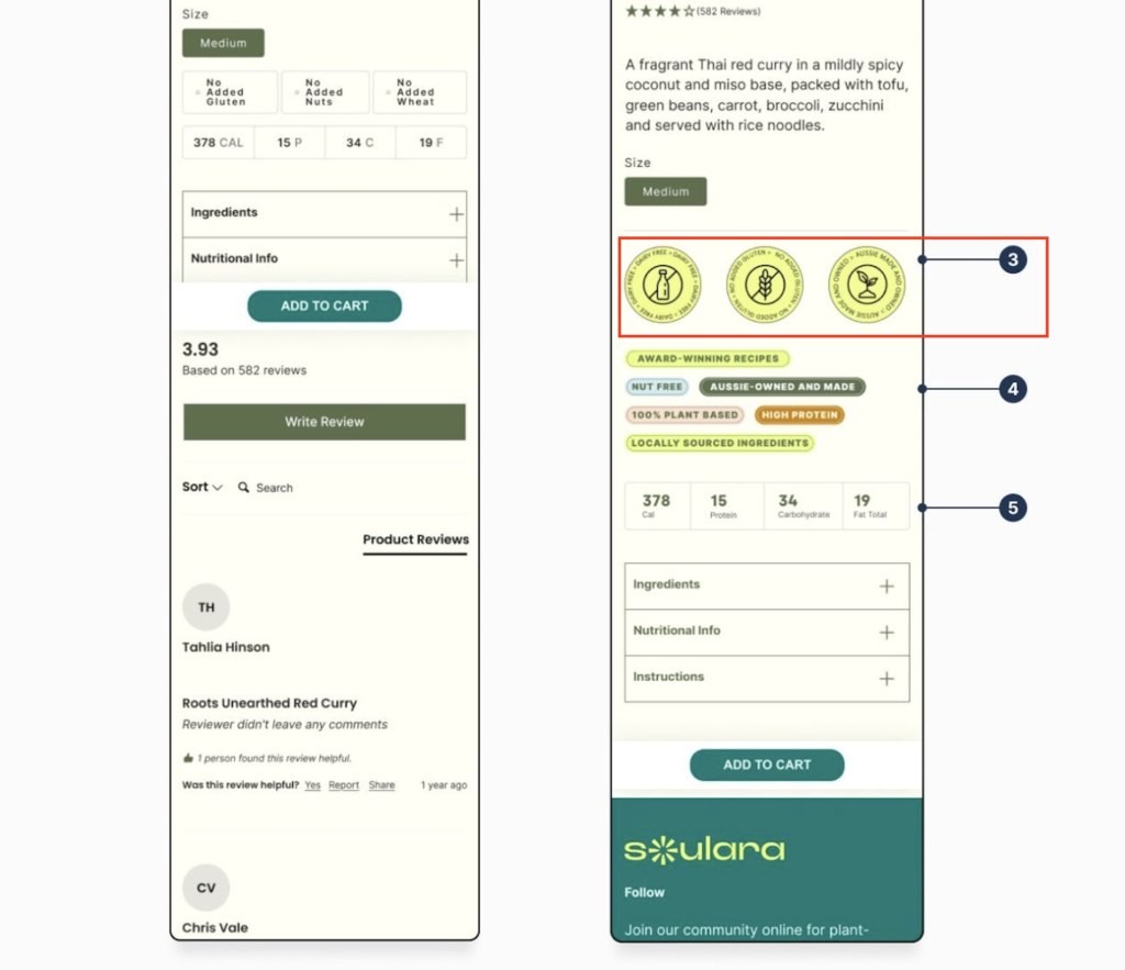
We introduced clear trust badges and benefit icons directly below the product information, ensuring they’re visible without scrolling.
These signals reinforce quality, suitability, and credibility at the exact moment users are deciding whether to continue.
Why it matters:
Product page conversion rate optimisation depends heavily on surfacing reassurance early — not hiding it lower on the page.

Rather than listing raw features, key product highlights were reframed into short, scannable value statements that explain why the product is worth buying.
This helps users quickly understand the benefits without cognitive overload.
Why it matters:
Clear value messaging shortens decision time and reduces drop-off on mobile product pages.

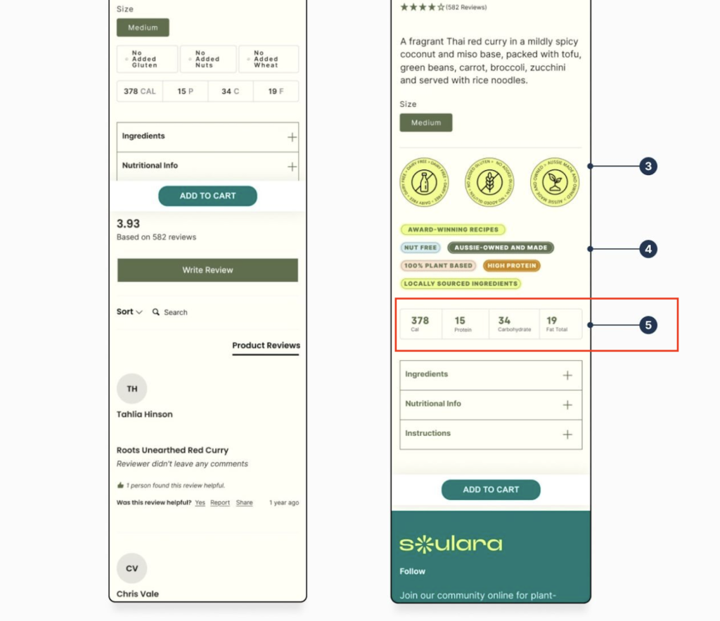
Nutritional and product detail information was reorganised into a cleaner layout, with secondary details placed inside expandable sections.
This keeps the page focused and conversion-oriented, while still supporting users who want deeper information.
Why it matters:
A simplified information hierarchy improves readability and keeps users moving toward “Add to Cart”.

By improving all of the points above, the updated product page creates a faster, more confident path to purchase.
Effective product page conversion rate optimisation isn’t about adding more elements. It’s about presenting the right information at the right time.
We help eCommerce businesses optimise product pages to reduce friction, build trust, and turn more visitors into customers without redesigning the entire site.