Mobile Ecommerce Product Page Optimisation

Service

CRO

Niche

Electric Bikes

Introduction

For high-value products, a product page has to do more than list features. It needs to quickly build confidence, answer the right questions, and make the next step feel obvious, especially on mobile.

In this case, the product itself was strong. It was well designed, purpose-built, and clearly premium. The issue wasn’t the offering, but how it was being presented. Too many users were landing on the product page and dropping off before taking action because the page wasn’t clearly communicating value, trust, or what to do next.

Our focus was to reshape the mobile experience around how people actually make decisions with considered purchases. 

Partner with us
0%
Increased test ride bookings

Making the test ride option visible from the top of the page gave users a clear, lower-pressure way to engage. 

0%
Stronger product page engagement

The clearer layout and improved content flow helped users stay on the page longer and explore the product in more detail.

0%
Higher action intent

By bringing pricing, availability, and key CTAs closer together, more users took meaningful steps, including adding the product to cart or booking a test ride.

0m
Timeframe

All changes were rolled out through small, focused updates and monitored carefully to avoid disrupting existing traffic or performance.

Here are the five improvements we made:

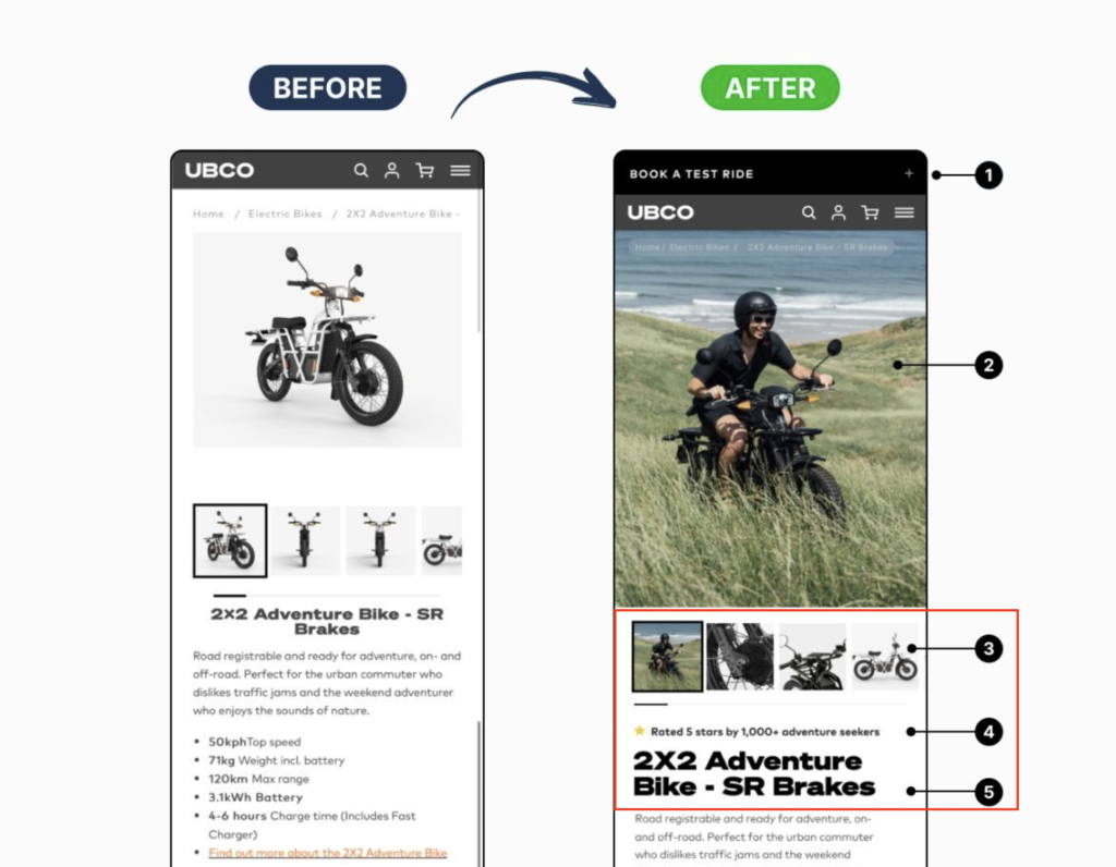
1. Improved Announcement Bar & Immersive Hero Imagery

The product hero image was upgraded from a static product shot to a lifestyle-focused image that shows the bike in use. This immediately communicates value, context, and emotional appeal before users engage with specifications. We added a persistent, high-visibility announcement bar at the top of the page to promote the key high-intent action: booking a test ride. This keeps the primary offline conversion pathway visible from the moment users land on the page, without requiring scroll.

Why it matters: Lifestyle imagery builds trust, increases perceived value, and helps users visualise ownership - all critical for high-consideration purchases. For considered purchases, many users aren’t ready to “buy now” on mobile. A strong test-ride CTA captures demand earlier in the journey and provides a lower-friction next step.

2. Clear Product Identity & Social Proof Above the Fold

We repositioned the product title, rating, and review count higher on the page to clearly establish what the product is and why it’s trusted. Social proof is now visible without scrolling, reinforcing credibility early in the decision process.

Why it matters: Users want reassurance quickly. Showing ratings and reviews early reduces uncertainty and increases confidence to continue down the page.

3. Scannable Key Specifications & Value Highlights

Key technical specs (speed, range, battery, charging time) were redesigned into a clean, scannable layout. This allows users to quickly evaluate whether the product meets their needs without reading long blocks of text.

Why it matters: Clear, digestible specs reduce cognitive load and help users self-qualify faster, keeping high-intent users engaged.

4. Price, Urgency & CTA Grouped Above the Fold

The product price was made more prominent and paired with a clear urgency message (“Limited stock – act fast”) directly beneath it. The primary CTA was then placed immediately below, creating a clear, linear path from price → motivation → action without requiring any scrolling.

Why it matters: Clear pricing combined with urgency and an instantly visible CTA reduces hesitation and shortens the decision-making process on mobile.

5. Visual Variant Selection & Benefit-Led Reinforcement

Colour selection was redesigned using visual swatches instead of text-only options, reducing friction when choosing variants. Below this, benefit-led content blocks reinforce performance, ease of use, and reliability to support final decision-making.

Why it matters: Visual variant selection speeds up interaction, while benefit reinforcement answers lingering objections before purchase.

Summary

Together, these improvements transformed the product page into a mobile-first, decision-driven experience. Reducing friction, increasing clarity, and guiding users smoothly toward conversion.

Need help improving your product page conversions?

We help eCommerce businesses optimise product pages to reduce friction, build trust, and turn more visitors into customers without redesigning the entire site.