
Most advice around conversion rate optimisation is theoretical. What actually moves the needle is applying proven changes, in the right order, based on real user behaviour.
In this article, we break down the highest-impact conversion rate optimisation best practices we’ve tested across multiple ecommerce projects, covering mobile navigation, product pages, checkout flow, trust signals, and content clarity. Each improvement is backed by real case studies, not assumptions, showing what consistently improves conversion rates in practice.
Clearer user journeys and better-placed CTAs helped more visitors complete key actions across the site.
Reducing friction and surfacing key product information earlier encouraged stronger buying intent.
Improved layout, content hierarchy, and visual clarity led to longer sessions and deeper interaction.
All changes were rolled out through small, focused updates and monitored carefully to avoid disrupting existing traffic or performance.
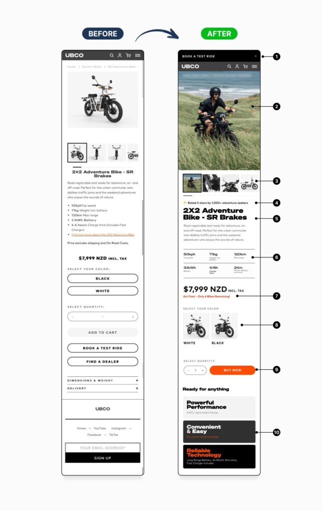
For high-value products, the biggest conversion barrier is rarely the product itself. In this case, drop-off was driven by a mobile experience that didn’t build confidence quickly enough or clearly guide users toward the next step.
The product page was restructured around how users actually make considered purchase decisions on mobile. Key trust signals, product identity, and specifications were surfaced earlier, while pricing, urgency, and primary CTAs were grouped into a clear, linear flow above the fold. A prominent, low-commitment action (test ride booking) was also introduced to capture intent from users not yet ready to purchase.
By reducing friction, improving clarity, and aligning the page with real decision-making behaviour, the changes led to higher engagement, stronger action intent, and a measurable uplift in test ride bookings. All delivered through a controlled, low-risk rollout.
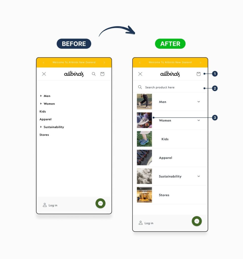
On mobile, navigation is often the first point where friction appears. If users can’t quickly understand where to go or how to find products, they’re far more likely to exit before reaching a product page.
In this case, the mobile menu was redesigned to reduce scanning effort and speed up decision-making. Search was surfaced as a primary shortcut, key utility actions were made consistently visible, and visual category cues replaced long text-based lists. Together, these changes made it easier for users to orient themselves, move confidently through categories, and reach product listings faster.
By simplifying the navigation structure and introducing clearer visual guidance, the updated menu improved engagement, increased menu-to-category interactions, and helped more users reach product pages through a smoother, lower-friction mobile experience.
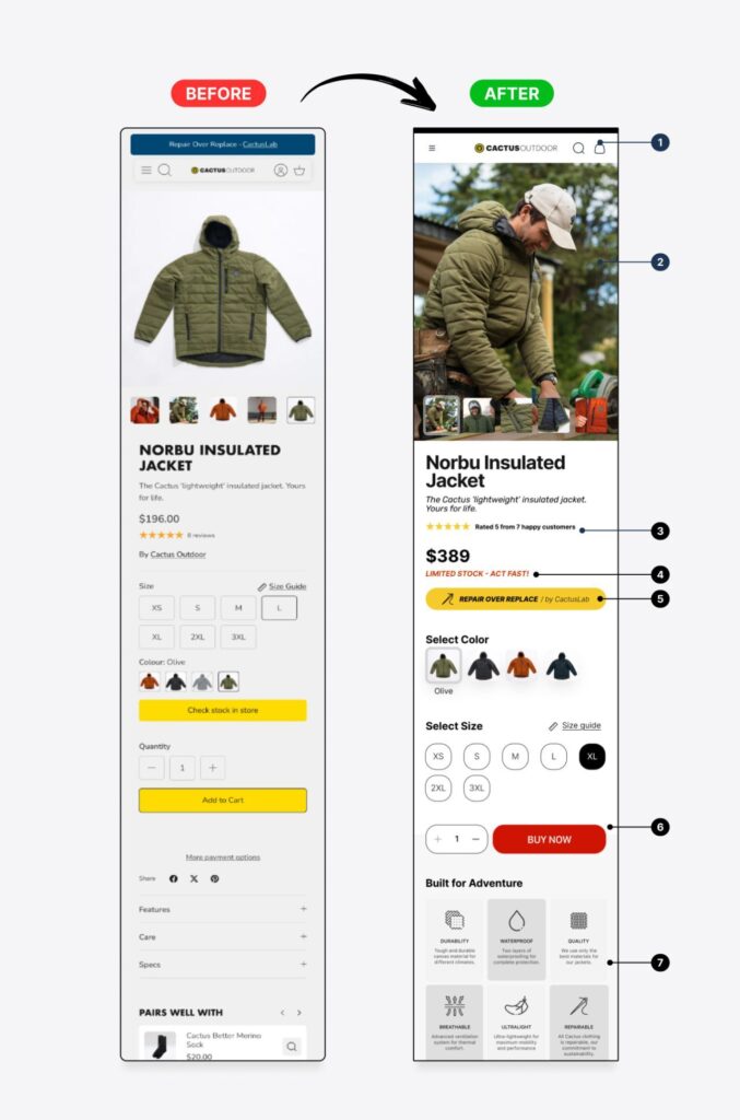
For apparel brands, conversion depends on quickly justifying value, quality, and fit especially on mobile, where users decide fast. In this case, strong traffic was reaching product pages, but uncertainty around differentiation and value was preventing users from taking action.
The product page was restructured to align with how customers evaluate clothing online. Lifestyle imagery, reviews, pricing, urgency, and key benefits were surfaced earlier, while the path to purchase was simplified with clearer CTAs and reduced visual friction. Brand reassurance and value messaging were also repositioned closer to the point of action to reinforce confidence at the decision moment.
The updated page reduced hesitation, improved engagement, and increased progression toward checkout; all delivered through targeted UX updates without disrupting existing traffic.
Checkout is often where uncertainty has the biggest impact. Even small gaps in clarity around pricing, delivery, or payment can cause users to abandon just before completing a purchase.
In this case, the checkout experience was refined to remove friction at the final decision point. Key information such as progress, pricing, delivery reassurance, and payment options was surfaced more clearly, while subtle cross-sell opportunities were introduced without disrupting the primary goal of completion.
By simplifying the checkout experience and reinforcing trust at critical moments, these changes reduced abandonment, increased average order value, and helped more users complete their purchases.
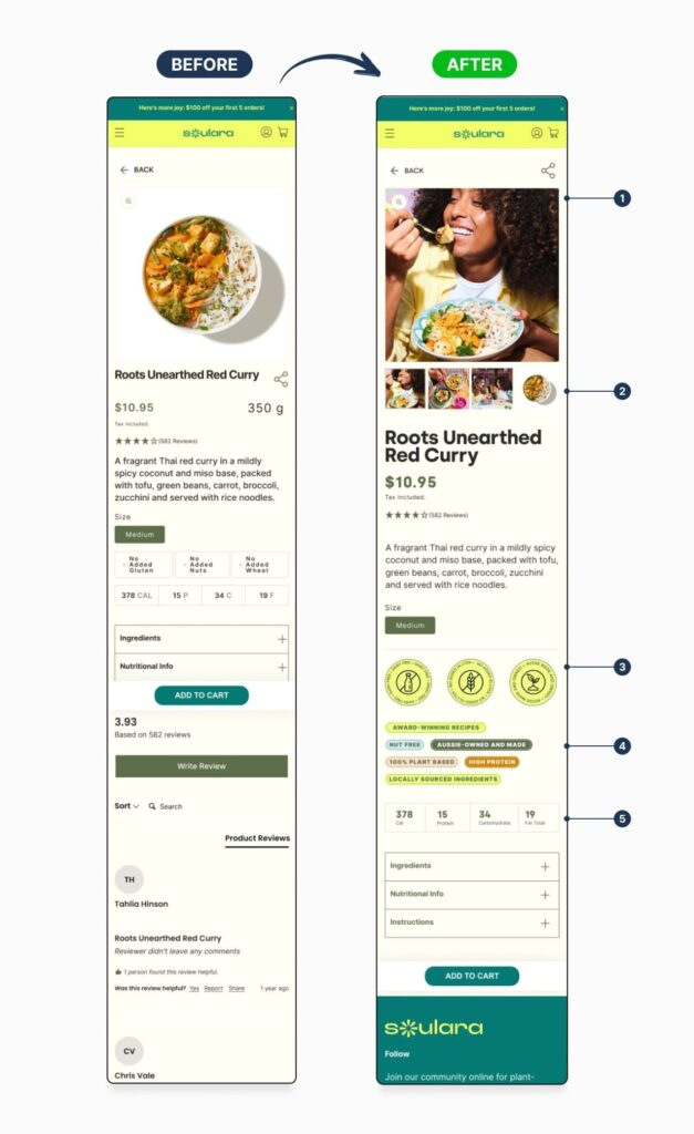
Product page conversion rate optimisation often comes down to removing hesitation at the exact moment users decide whether to proceed or leave. In this case, drop-off was occurring because key reassurance benefits and visual context were being surfaced too late in the journey.
The product page was restructured to prioritise clarity over volume. Lifestyle imagery and supporting visuals helped users better understand the product in context, while trust signals and benefit-led messaging were introduced earlier to reinforce confidence. Information hierarchy was simplified to keep the page focused on progression, without overwhelming users who wanted deeper detail.
We lowered exits, increased add-to-cart behaviour, and improved progression into checkout; all delivered through targeted UX updates rolled out in a controlled timeframe.
Across every case study in this article, one pattern is consistent: meaningful conversion gains don’t come from adding more elements, features, or complexity. They come from improving clarity, reducing friction, and applying strong landing page design principles that present the right information at the moment users are ready to decide.
Whether it’s navigation, product pages, or checkout, the most effective conversion rate optimisation focuses on:
Guiding users confidently through the journey
Surfacing trust, value, and reassurance earlier
Removing hesitation at key decision points
These improvements were delivered through small, targeted updates rather than full redesigns and implemented in a way that protected existing traffic while driving measurable results.
If there’s one lesson to take away, it’s this: conversion rate optimisation works best when it’s driven by real user behaviour, not assumptions. Small changes, applied in the right order, consistently outperform large, unfocused redesigns.
We help eCommerce businesses optimise product pages to reduce friction, build trust, and turn more visitors into customers without redesigning the entire site.