
For apparel brands, product pages need to do more than showcase the item; they need to justify price, quality, and value in seconds, especially on mobile.
In this case, the brand was driving strong interest to its product pages, but too many users were dropping off before taking action. The products were premium, well-designed, and purpose-built, yet the page structure wasn’t clearly communicating why they were worth buying or what made them different.
Our focus was to better align the product page with how customers actually evaluate clothing online: seeing the product in use, trusting the feedback of other buyers, understanding benefits, and having a clear, confident path to purchase.
Improved clarity and structure reduced hesitation and helped users progress further down the page.
More users initiated purchase after pricing, reviews, and urgency were surfaced earlier.
All improvements were implemented through targeted UX updates without disrupting existing traffic or campaigns.
All improvements delivered through small, strategic updates and monitoring.
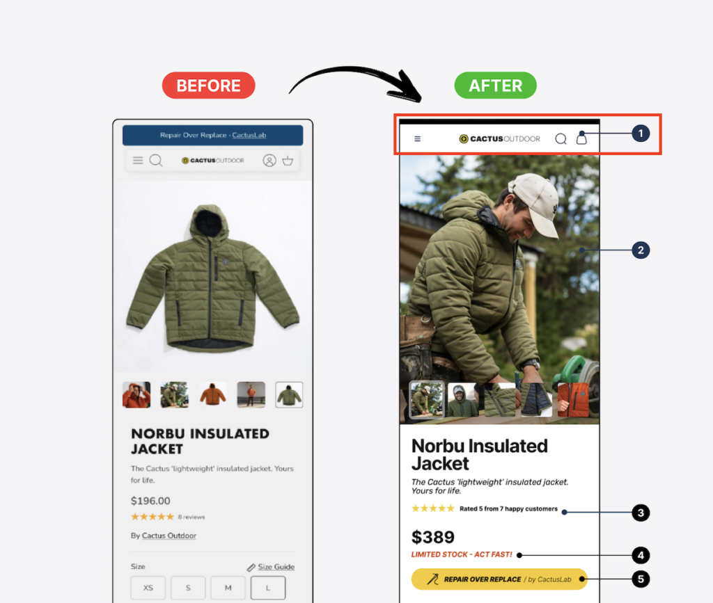
We simplified and restructured the top header area to improve navigation clarity and usability on mobile. The updated layout makes key actions (menu, search, and cart) more prominent and easier to access, while reducing visual clutter at the top of the page.
In the previous version, the header competed with the product content and created friction early in the user journey. The updated structure prioritises usability and keeps attention focused on the product, while still clearly surfacing essential navigation elements.
Why it matters: A clearer, more intuitive header reduces friction at the top of the page, improves mobile usability, and helps users move through the site with less effort — supporting stronger engagement and smoother progression toward conversion.
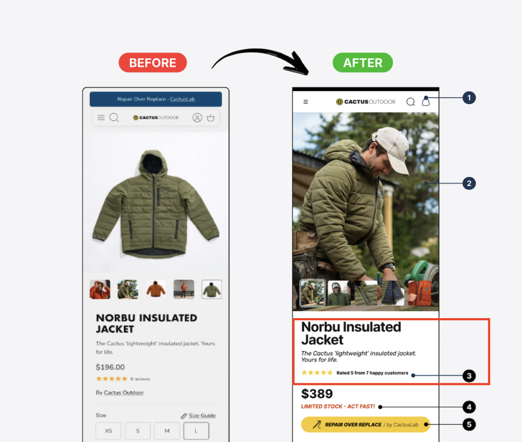
We replaced static product imagery with a lifestyle-focused hero image that shows the product being used in context.
This immediately communicates quality, relevance, and emotional appeal helping users visualise the product in real life rather than evaluating it as a standalone item.
Why it matters:
Stronger emotional connection increases engagement and purchase intent early on the product page.

Customer reviews were moved directly under the product title so star ratings and review count are visible immediately on page load. This brings social proof into the main decision area instead of hiding it further down the page.
Why it matters:
Displaying reviews early builds trust faster and helps reduce hesitation, especially on higher-priced products.
The product price was made more prominent and paired with a clear urgency message (“Limited stock – act fast”) directly beneath it. The primary CTA was then placed immediately below, creating a clear, linear path from price → motivation → action without requiring any scrolling.
Why it matters:
Clear pricing combined with urgency and an instantly visible CTA reduces hesitation and shortens the decision-making process on mobile.

The “Repair Over Replace” message was moved from the announcement bar into the main product decision area, positioned directly above the primary CTA. This ensures the brand value and reassurance message is seen at the point of action, rather than being missed or ignored at the top of the page.
Why it matters:
Placing key messaging next to the CTA reinforces trust and purpose at the exact moment users decide to buy, increasing the likelihood of conversion.

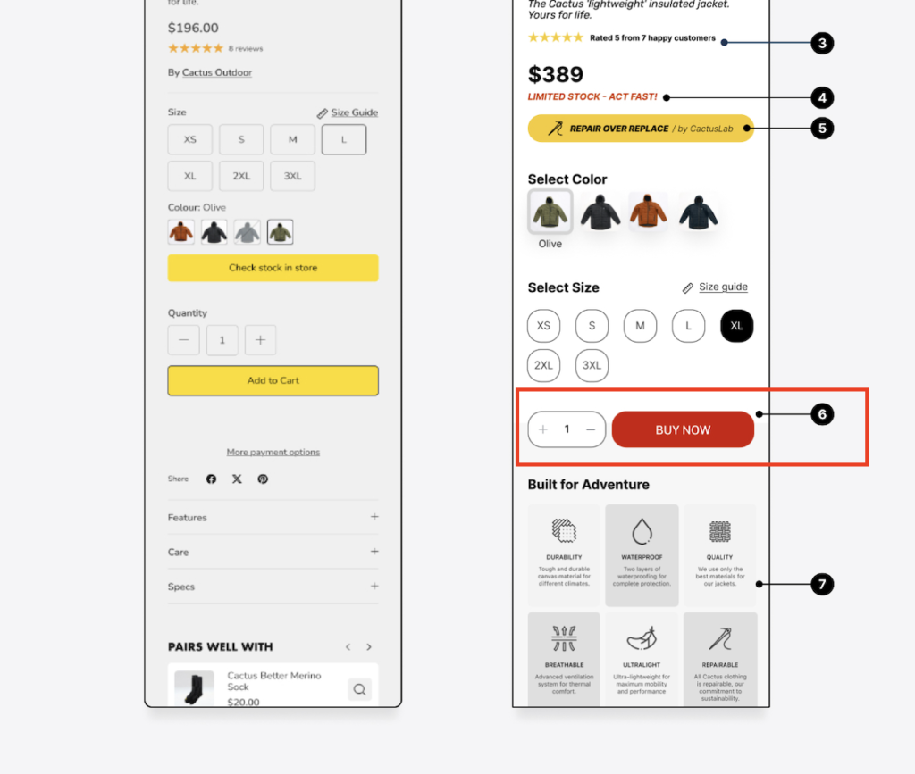
The purchase action was simplified from multiple buttons into a single, high-contrast “Buy Now” CTA placed directly beneath size selection. Quantity controls were kept inline to reduce friction, while removing secondary actions that distracted from the primary goal.
Why it matters:
A single, dominant CTA creates a clearer next step, reduces choice overload, and helps guide users toward purchase more decisively on mobile.
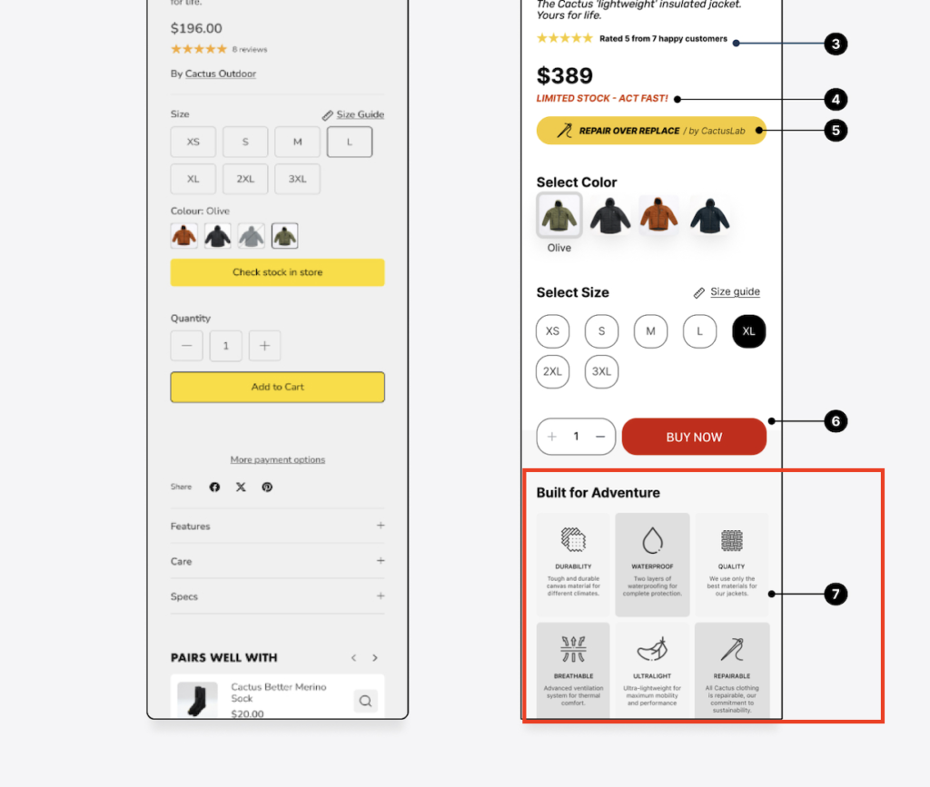
A dedicated USPs section was added directly below the primary CTA, using simple icons and short labels to highlight core benefits such as durability, waterproofing, breathability, and repairability. This allows users to quickly scan and understand what makes the product valuable without reading long descriptions.
Why it matters:
Icon-led benefits improve clarity and scannability on mobile, reinforcing value and confidence immediately after the purchase decision point.
By improving all of the points above, the updated product page creates a faster, more confident path to purchase.
Effective product page conversion rate optimisation isn’t about adding more elements. It’s about presenting the right information at the right time.
We help eCommerce businesses optimise product pages to reduce friction, build trust, and turn more visitors into customers without redesigning the entire site.