Mobile Ecommerce Menu Design: UX Improvements hepled customers find products faster

Service

CRO

Niche

Shoes eCommerce

Introduction

On mobile, navigation plays a direct role in whether users continue shopping or leave. Small points of friction at this stage tend to compound quickly, leading to lower engagement and fewer users reaching product pages.

In this case, the existing mobile menu was functional but inefficient. Users were required to scan long text-based lists, search was easy to miss, and there were few visual cues to help guide decision-making. This resulted in slower product discovery and unnecessary drop-off before users even reached a product listing.

Partner with us
0%
increase in users reaching product listings

The updated menu structure made it easier to understand where each category leads. Users could move confidently through Men, Women, Kids, and Apparel without second-guessing their next tap.

0%
increase in menu-to-category clicks

By bringing search to the top of the menu and adding visual category cues, users could find what they were looking for more quickly instead of scanning long text lists.

The three improvements that removed the most friction:

1. Persistent Utility Icons (Cart & Close)

The utility icons were simplified and made more prominent, keeping the cart and close actions consistently visible at the top of the menu. This ensures users always know how to exit the menu or check their cart without hunting for controls.

Why it matters: Clear, predictable utility actions reduce friction and help users feel in control, especially on mobile where screen space is limited.

2. Search Bar Positioned at the Top of the Menu

Search was moved to the top of the navigation and visually separated from category links. This gives users an immediate shortcut to find products without needing to browse through menus.

Why it matters: Many mobile shoppers prefer searching over browsing. Surfacing search early shortens the path to product discovery and supports higher-intent behaviour.

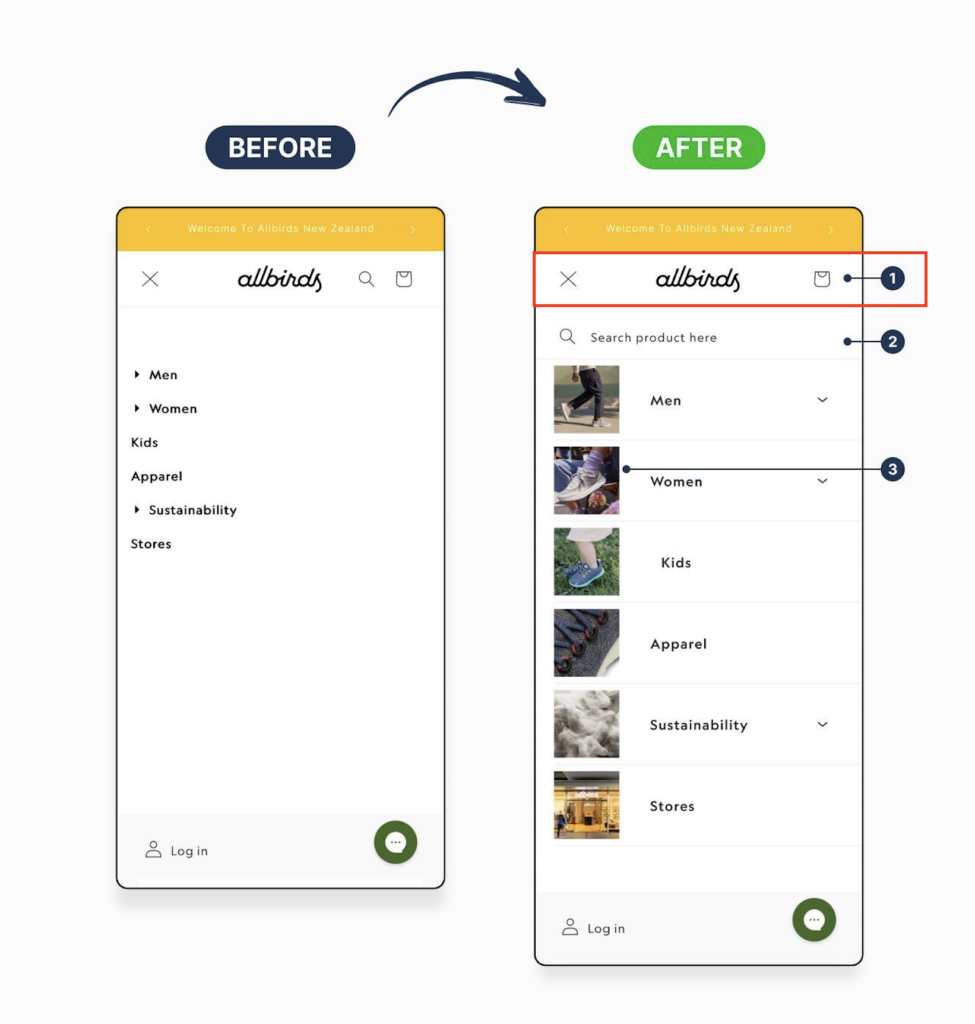
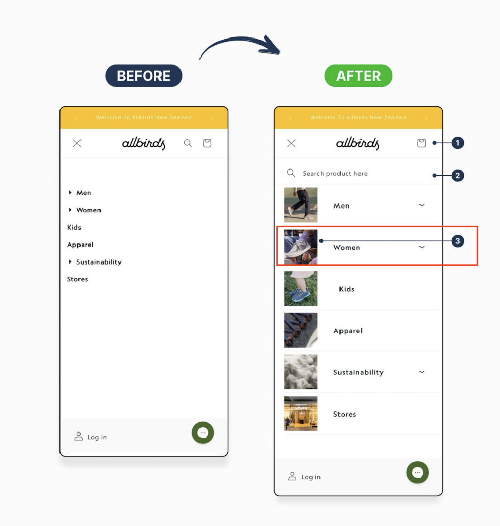
3. Visual Category Navigation with Imagery

Primary categories were redesigned using images alongside labels, replacing the text-only list. This makes each category easier to recognise at a glance and adds visual context to the navigation.

Why it matters: Visual cues reduce cognitive load, speed up decision-making, and help users orient themselves faster, particularly for browsing-led shopping journeys.

Summary

These changes shifted the mobile experience from a simple menu into a clear starting point for shopping. With less friction and better visual cues, users can move faster, find products more easily, and take action with confidence.

Need help improving your product page conversions?

We help eCommerce businesses optimise product pages to reduce friction, build trust, and turn more visitors into customers without redesigning the entire site.