How We Improved Checkout Conversions With 5 Targeted UX Changes

Here are the five improvements we made:
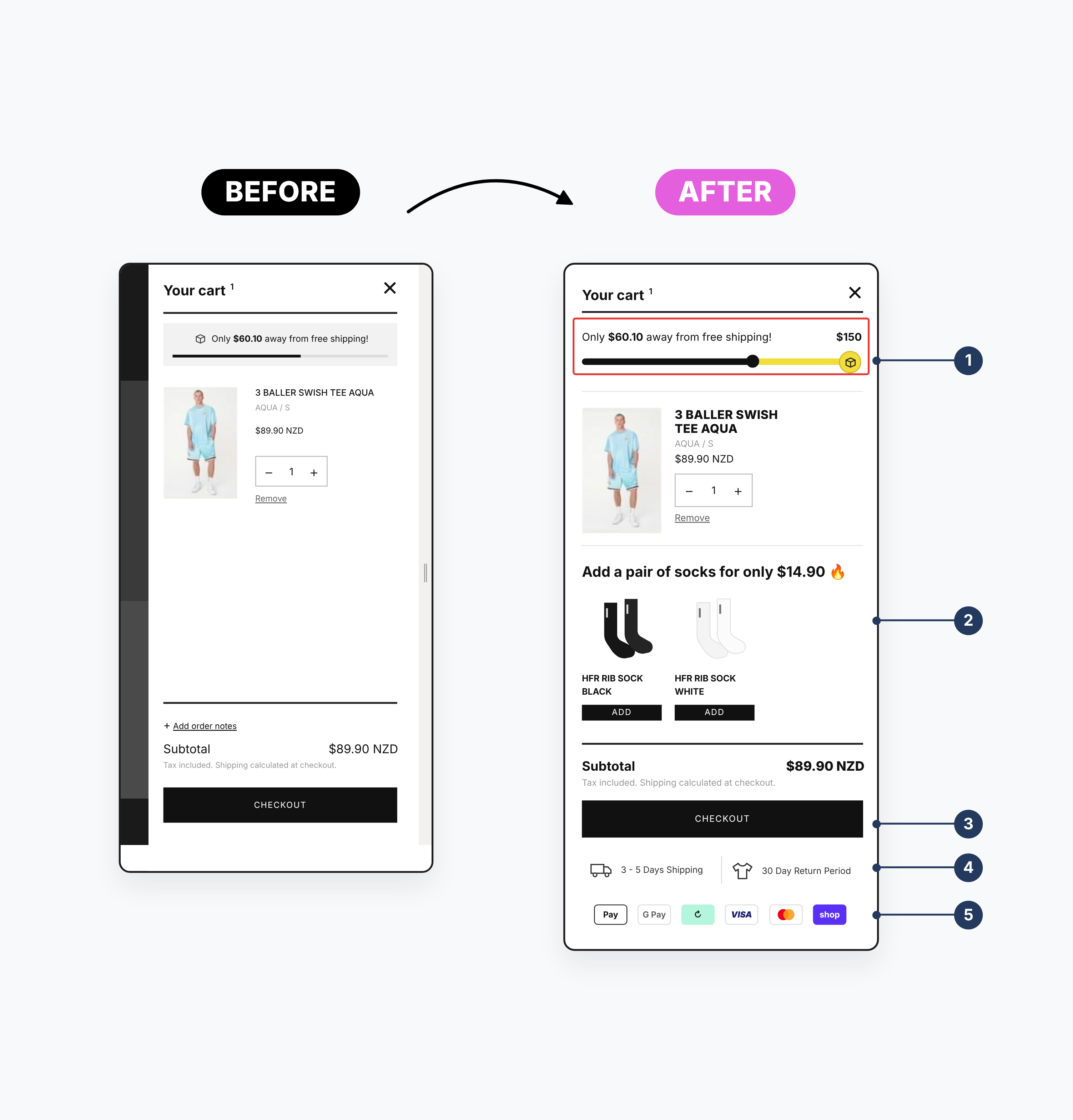
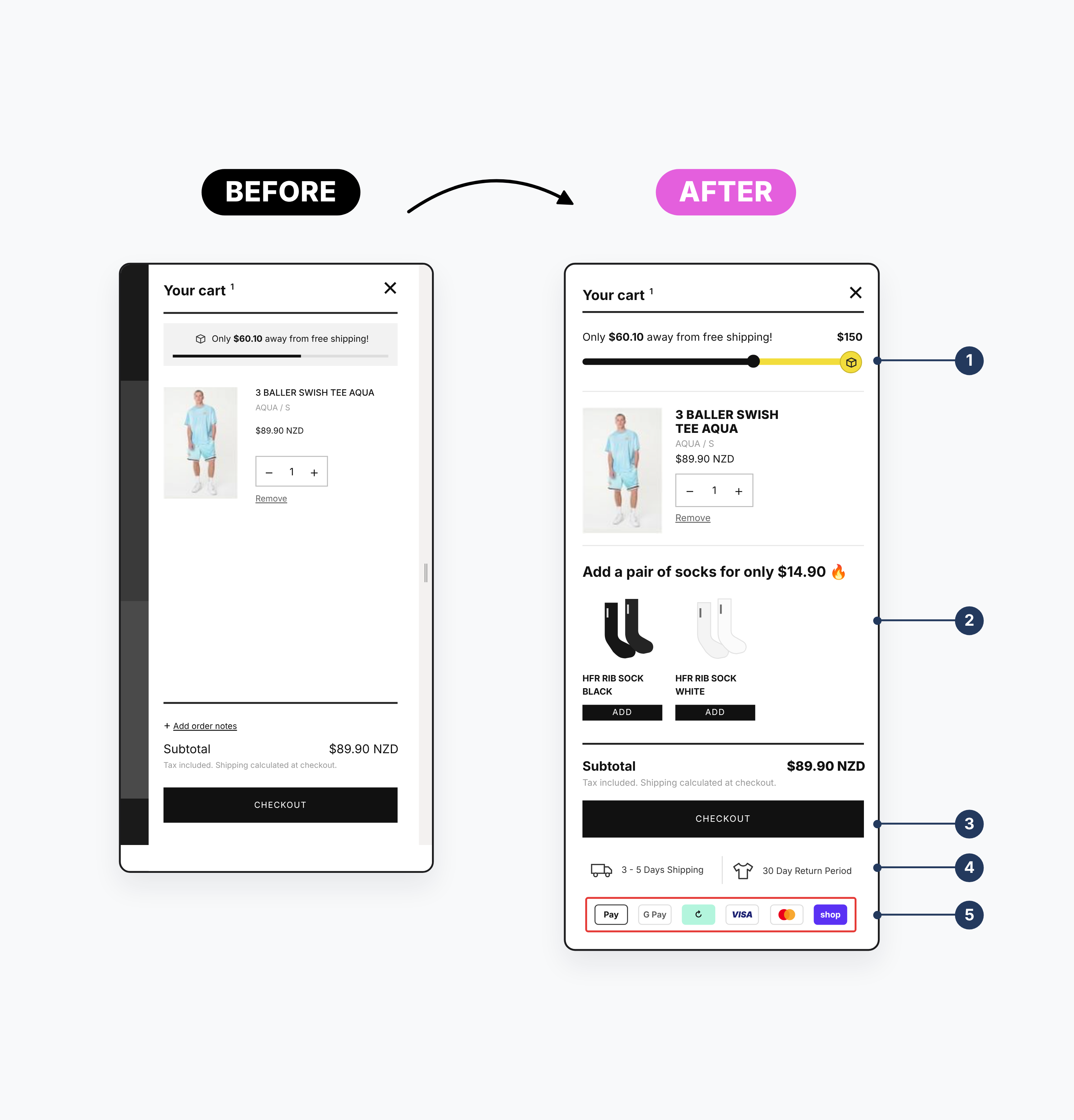
Added a Streamlined Shipping Progress Bar
Customers want to know how far along they are in the checkout process. A simple visual progress bar gives them clarity and reduces the chance of drop-off due to uncertainty. It builds momentum and makes the process feel faster.
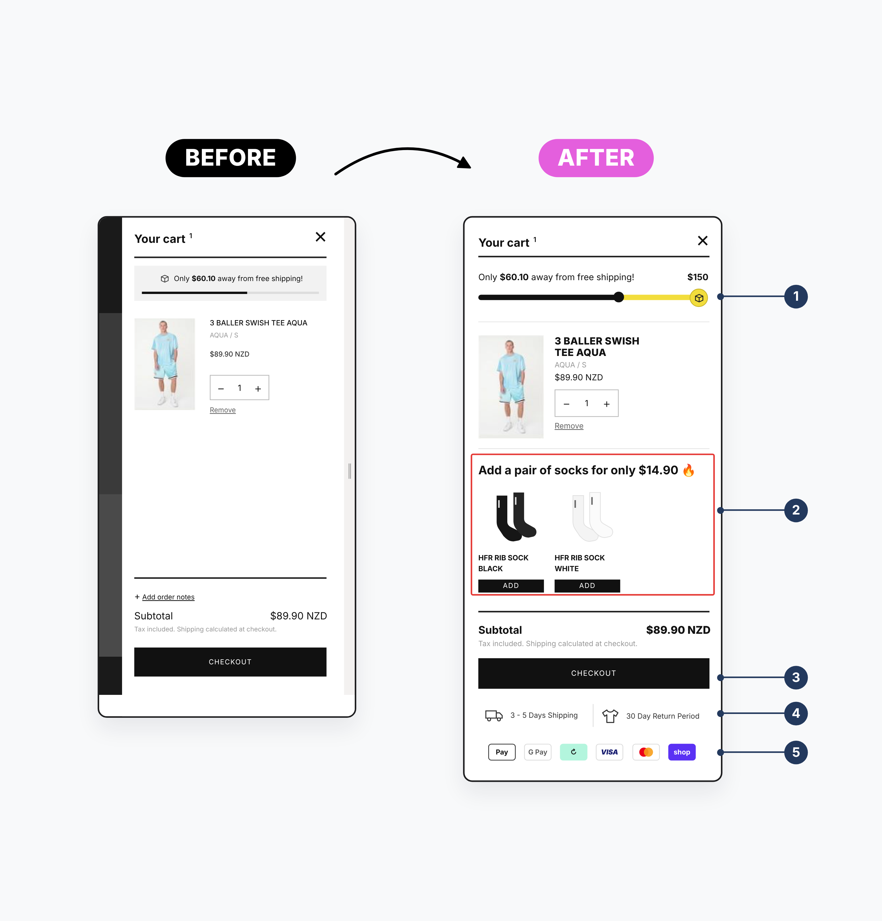
Included a Cross-Selling Section
Right before checkout is a great moment to introduce customers to related or complementary products. We added a clean, non-intrusive section suggesting items that paired well with what they’d already selected - an easy way to lift AOV without being pushy.
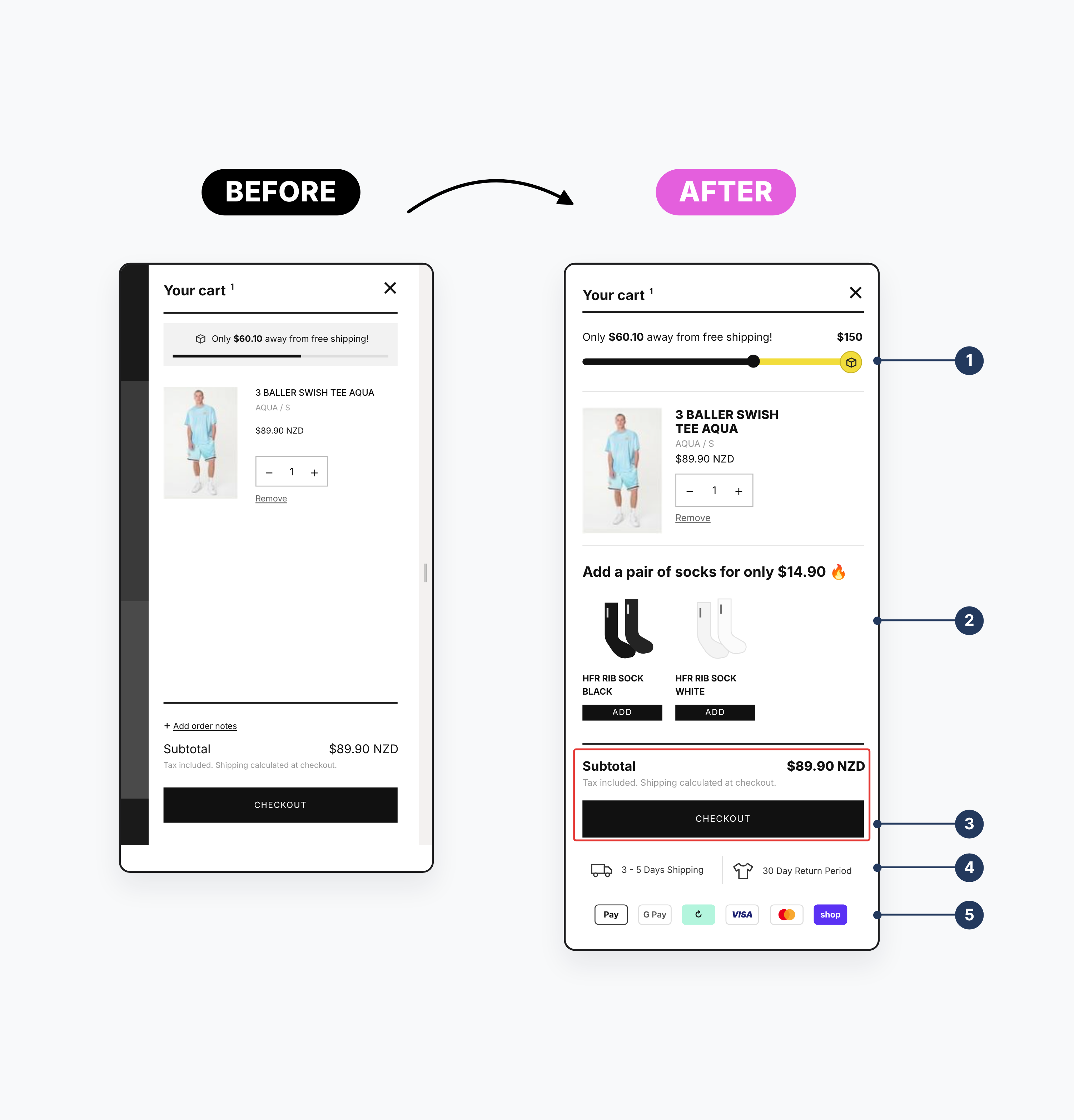
Bolded Pricing for Clarity
Shoppers want pricing transparency. By bolding key prices (including totals and shipping fees), we reduced confusion and helped customers feel more secure in their decisions. When pricing is clear, trust goes up and so does conversion.
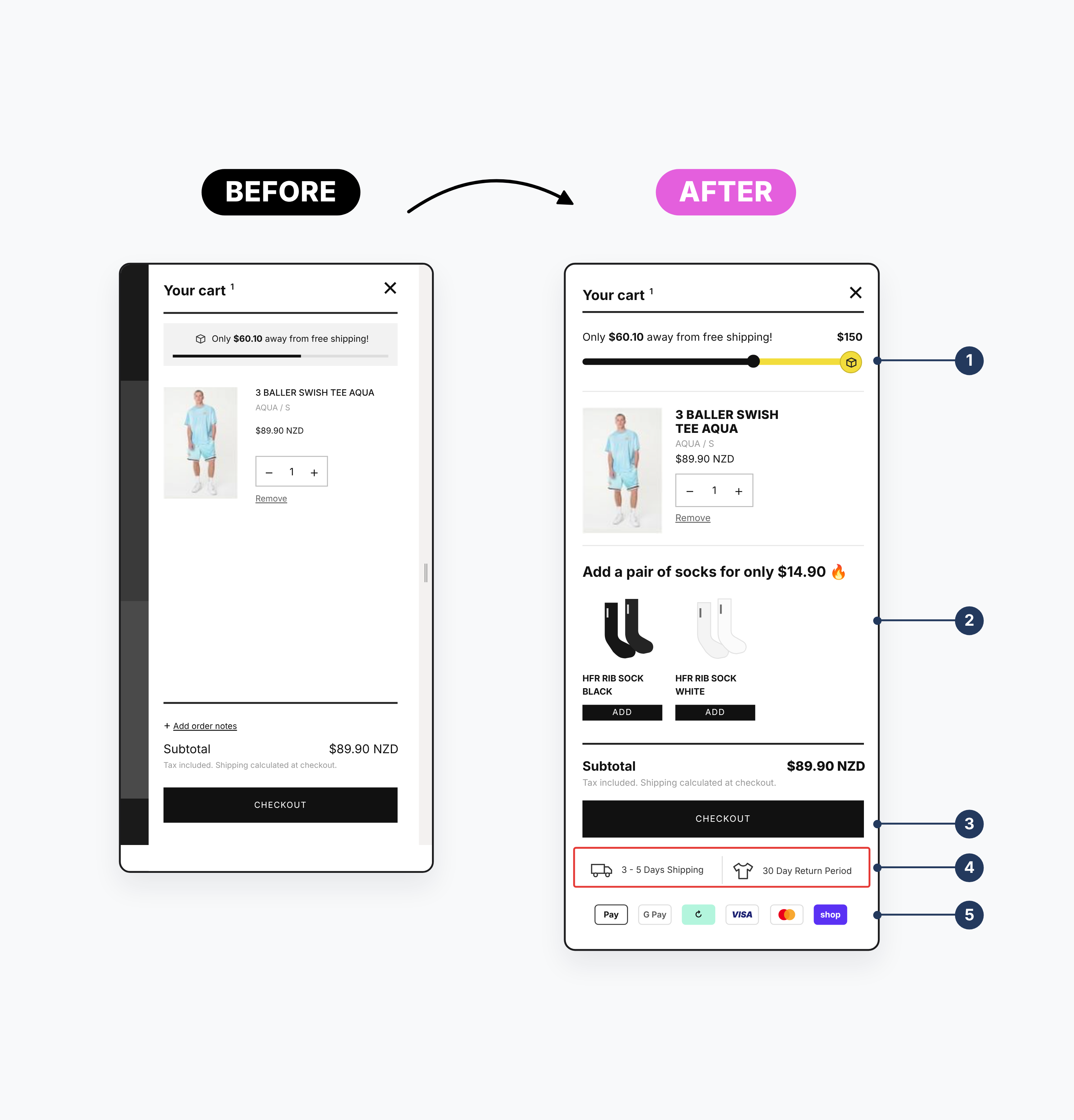
Highlighted Return and Shipping Info Upfront
Don’t make customers hunt for important policies. We placed key return and shipping information right where shoppers could see it—before entering their payment details. This small change can make a big difference in reducing hesitation and building trust.
Displayed Accepted Payment Methods Visually
Icons of accepted payment methods give users peace of mind and help answer a critical question quickly: Can I pay the way I want to? This visual reassurance removes a final barrier to completing the purchase.

Summary
These updates are more than cosmetic - they’re strategic tools that: build customer trust, speed up the checkout process, encourage larger orders, reduce cart abandonment.
At the end of the day, it’s not about adding more. It’s about removing friction and making it easy for your customer to say yes.
Simple updates, big impact.

related
✱


move your business

forward
Tell us where you are and where you want to go.